Text paper
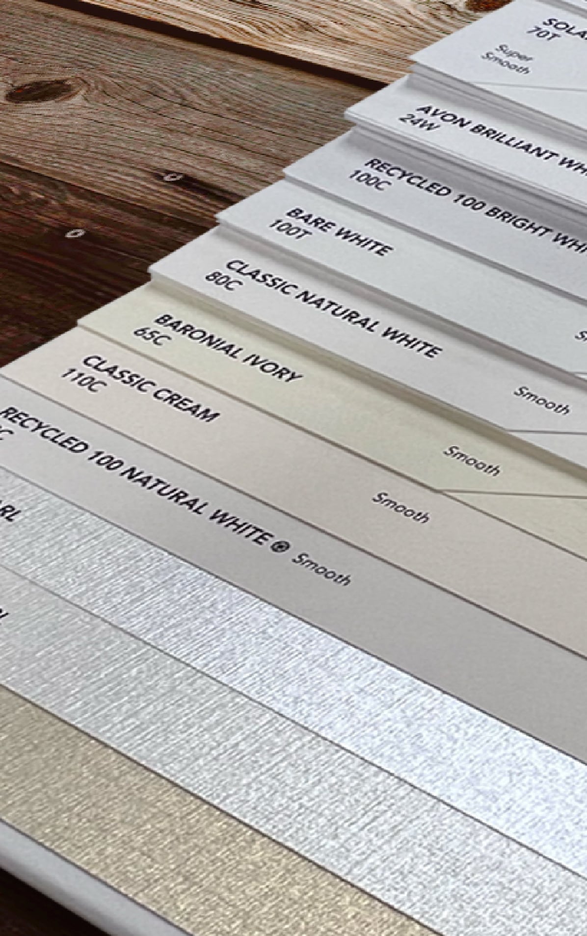
Smooth, flexible stock for brochures, newsletters, and booklet interiors — a refined feel without unnecessary bulk.
Resource guide · The swatch book
Type, weight, and finish — the three decisions that set how a printed piece feels the moment someone picks it up. This guide walks the swatch book the way our pressroom does: the stocks we run every week, the real pound and point figures, and where each sheet earns its place.
PDF · 2 pages · 1.2 MB
01 Type
Two shelves in the swatch book: the standard stocks that carry most jobs cleanly and affordably, and the specialty sheets that make a piece feel like an occasion.
Smooth, flexible stock for brochures, newsletters, and booklet interiors — a refined feel without unnecessary bulk.
Thicker and more durable than text paper, giving the piece structure and presence the moment it changes hands.
Standard stocks offer consistency, reliability, and an approachable price. They are the right call for communications that need to look clean and professional without extra embellishment.
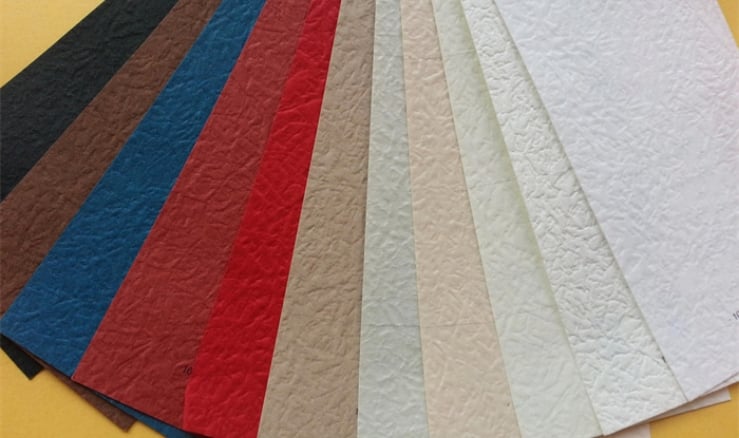
Specialty stocks add character, texture, and visual interest — a tactile first impression the reader registers before a single word.
Environmentally responsible sheets with strong print performance, for brands that lead with sustainability.
A shimmering, elegant sheen. At home on invitations, luxury branding, and high-end promotions.
Subtle texture that adds gentle dimension — premium in the hand without overwhelming the design.
Richly textured, classic sheets for certificates, donor communications, and formal invitations.
Tear-resistant material built to last — menus, outdoor signage, maps, and industrial applications.
Bold or rustic stocks that carry a brand personality — packaging, tags, and standout branded pieces.
02 Weight
Heavier stock feels substantial and premium; lighter stock folds cleanly and keeps multi-page pieces from bulking up. The pound figure is the weight of 500 sheets at that grade’s parent size — which is why 80 lb. text and 80 lb. cover are very different sheets.
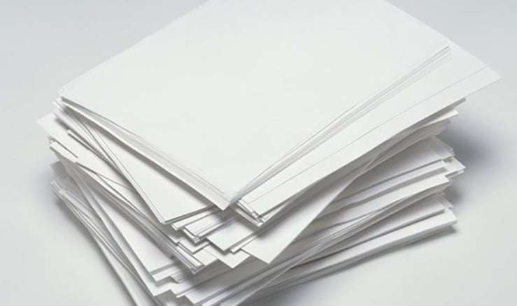
Lightweight and pliable — smooth page-turning, easy folding, sturdy enough for regular handling.
Budget-friendly flyers, inserts, and manuals.
The reliable choice for letters, newsletters, and standard booklet interiors.
A touch heavier — adds polish to brochures and self-mailers.
The premium interior sheet for brochures, booklets, and marketing pieces where print quality matters.
Thicker and more durable — the stock you choose when the piece should feel substantial in someone’s hands.
Versatile: booklet covers and lightweight postcards.
The workhorse for postcards, rack cards, and marketing pieces.
Extra rigidity for folded cards and postcards that get handled.
A premium-feeling sheet that reads as quality on contact.
Board stocks with maximum rigidity — pieces designed to stand out through sheer physical presence.
Durable enough for dimensional mailers and lightweight packaging.
The popular pick for high-end postcards and retail cards.
Ultra-thick, unmatched rigidity — premium mailers and business cards.
What we run when the piece has to survive the mail stream and still land well.
100 lb. cover, 110 lb. cover, 12 pt, or 14 pt — set by the rigidity you want and the budget you have.
Folded and dimensional mailers run on 10–14 pt coated cover — durable, but still folds clean.
03 Finish
Finish decides what ink does when it lands: sit crisp on the surface, or soak in soft. It is the difference you feel with a thumb before you can name it.
A coated surface keeps ink from absorbing too deeply, so details stay crisp and color stays vibrant. The fit when visuals do the selling — marketing materials, product imagery, photography.
Uncoated stock absorbs ink readily, giving a softer, more organic look. It feels natural to the touch and reads as warmth, sincerity, and craftsmanship.
Because it takes handwriting beautifully, uncoated is the standard for letters, stationery, nonprofit appeals, reply cards, and forms.
Pressroom footnote: uncoated often gets called “matte,” but real matte is a coating — a dull-coated sheet. If you want the bare sheet, ask for uncoated.
04 The ticket
We print every spec on this page and plenty that are not. When the swatch book feels bigger than the decision, these pairings are where we would start.
| Project | Type & weight | Finish |
|---|---|---|
| Brochures | 80–100# text | Any |
| Postcards | 100–130# cover or 9–14 pt | Any |
| Letters | 60–70# text | Uncoated |
| Booklets | Cover 80–100# cover · inside 70–100# text | Any |
| Invitations | 100–130# cover or 14 pt | Uncoated |
Ranges, not rules — quantity, mailing plans, and finishing all move the answer. That is what the quote conversation is for.
05 The PDF
The whole swatch walk in two pages — keep it beside your next print order, or send it to whoever owns the artwork.
PDF · 2 pages · 1.2 MB
06 Your project
Paper is the one spec a screen cannot show you. Tell us the project, the quantity, and where it is headed — we will recommend a stock, share printed samples, and quote the run. Printing and mailing from one Mount Prospect plant since 1927.
Questions? Call 847.588.7600
